For years, interior design followed familiar color formulas. White and gray. Beige and brown. Black and white. These combinations became popular because they felt safe and timeless. But as more homes started looking similar, designers began searching for ways to add personality without making spaces feel overwhelming.
That’s where unexpected color pairings entered the picture.
Instead of relying on traditional combinations, today’s designers are experimenting with colors that once seemed unlikely to work together. Surprisingly, many of these unusual pairings create interiors that feel warm, balanced, and full of character.
The best part is that these combinations don’t require dramatic renovations. Sometimes, changing the relationship between colors is enough to make an ordinary room feel completely new.
Why Traditional Color Schemes Are Starting to Feel Predictable
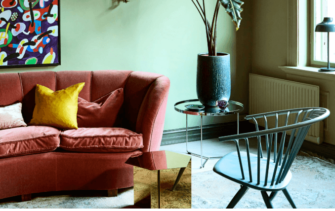
Neutral palettes dominated homes for more than a decade. They offered flexibility, simplicity, and a clean appearance. However, as these colors became increasingly common, many interiors started losing their individuality.
People began craving spaces that reflected personality rather than simply following trends.
Designers noticed this shift and started introducing combinations that added depth and emotion while still maintaining a sense of balance. Instead of choosing loud colors, they focused on creating harmony between shades that people normally wouldn’t think to combine.
The result is a new approach to decorating that feels fresh without feeling temporary.
Olive Green and Terracotta Create Warm Natural Spaces
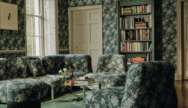
One of the most interesting combinations gaining popularity combines olive green with terracotta tones.
Olive green brings calmness and a connection to nature. Terracotta introduces warmth and earthiness. Together, they create rooms that feel grounded and welcoming.
Living rooms and dining spaces particularly benefit from this combination because both colors create comfort without relying on traditional neutral palettes.
Designers often use olive walls with terracotta cushions, artwork, or decorative accessories to create subtle contrast.
The overall atmosphere feels relaxed, sophisticated, and timeless.
Dusty Blue and Sand Tones Bring Soft Contrast
Blue has traditionally been paired with white, but designers are now using dusty blue alongside sandy beige tones.
The coolness of blue balances beautifully with the warmth of sand colors. Instead of feeling cold, the room feels peaceful and balanced.
Bedrooms especially benefit from this pairing because it creates an environment that feels calming without appearing overly plain.
The combination also works extremely well in homes that receive plenty of natural sunlight, since both colors change beautifully throughout the day.
Burgundy and Beige Add Unexpected Elegance
Burgundy once had a reputation for being too bold or dramatic. Today, designers are using it differently.
Instead of allowing burgundy to dominate a room, they pair it with soft beige tones. The result is elegant rather than overwhelming.
A beige sofa combined with burgundy accent pillows or artwork can instantly add personality to a neutral room.
This pairing proves that darker colors don’t always need to feel heavy. When balanced properly, they create richness and sophistication.
Sage Green and Dusty Pink Create Gentle Harmony
At first glance, green and pink may seem like an unusual combination.
However, soft versions of both colors work surprisingly well together.
Sage green introduces calmness, while dusty pink adds warmth and softness. Neither color competes for attention, which allows them to complement each other naturally.
This pairing has become increasingly popular in bedrooms, home offices, and cozy reading corners because it creates an atmosphere that feels both peaceful and inviting.
Charcoal and Warm Wood Tones Are Replacing Pure Black
Many homeowners once relied on black accents to create contrast. Today, charcoal shades are becoming more popular because they feel softer.
When combined with warm wood tones, charcoal creates depth without making a room feel too dark.
Modern kitchens and contemporary living rooms frequently use this combination because it balances sophistication with comfort.
The natural warmth of wood prevents the darker shades from appearing cold or industrial.
Why Designers Prefer Soft Contrasts Over Harsh Ones
Strong contrasts once dominated interior design.
Black against bright white created dramatic spaces that photographed beautifully. But over time, people realized that extreme contrast can feel visually exhausting when experienced every day.
Modern interiors now favor softer transitions between colors.
Instead of creating tension, these combinations create flow. Rooms feel easier to live in because the eye moves naturally throughout the space.
This shift reflects a broader trend in interior design: creating homes that prioritize comfort over perfection.
Texture Plays Just as Important a Role as Color
Color alone rarely determines the feeling of a room.
Texture influences how colors are perceived. Matte finishes feel softer. Woven fabrics add warmth. Natural wood introduces depth.
A dusty blue room filled with smooth surfaces will feel completely different from one layered with soft fabrics and textured materials.
Because of this, designers now think about texture and color as partners rather than separate design decisions.
Why Unusual Color Pairings Feel More Personal
Traditional color palettes often look beautiful, but they can also feel predictable.
Unexpected combinations give homeowners an opportunity to express personality without creating chaos.
Instead of copying the same color formulas seen everywhere, people are creating spaces that feel unique to their own tastes and lifestyles.
This shift has made interior design more personal and less dependent on strict rules.
The Future of Color in Interior Design
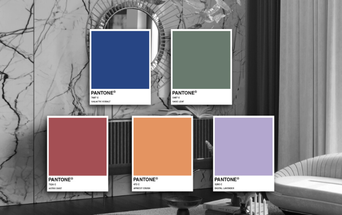
Designers are increasingly moving away from perfect color formulas and embracing experimentation.
Rather than asking which colors are trendy, they are asking how different colors make people feel.
This emotional approach is changing the way homes are designed. Colors are no longer chosen simply because they are popular. They are chosen because they create a certain atmosphere.
As a result, homes are becoming more individual, more comfortable, and more expressive than ever before.